A Wicked Ecstasy
Project 5
INQUIRY: In what ways are humans impacting the environment?
Size: 28.4(w) x 37.9(h) inches
Date of Completion: Nov 12, 2021
Ideas: portray the greed of corporates through metaphors and symbolism
Materials: Sketched with pencils, oil pastels, apple pencil; used iPad, Adobe Fresco and Photoshop
Process: combined traditional and digital media to make emphasis on the subject

Inspiration
poorteffy
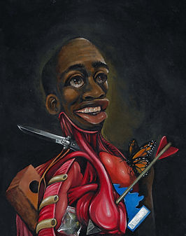
"Sticks & Stones"
Teffy, or poorteffy as I discovered him, is an artist that has a very distinctive style. His work is mainly surrealism with oil paint being the main form of media. What I like about the artworks is the creativity in portraying the narrative. In "Bad Side", Teffy takes on the well known shoulder devil/angel concept where in his case the devil triumphed by shooting the angel with a gun. The facial expression also complies with the conscience that won. This can also be seen in "Sticks & Stones" where the person is smiling even though its organs are being mutilated by a brick, knife and arrow.
His work are mainly portraits-like where they have a main point of interest in the foreground and the background is a plain yet heavily textured color. I love this approach since it is straightforward and makes everything clean and neat.

"Raw Deal"
"Unknown"

"Bad Side"
The
Planning

Going into the fifth project, I initially selected the topic of "the wealthy" to criticize the amount of ridiculous carbon footprint released by those with extremely high income. I created a mind map in hope of coming up with more ideas, but it turned out to be repetitive since most of them were technically the same as my older themes. For this reason, I decided to change my theme entirely to corporate greed since I had already had a sketch in mind for it.
I wanted this piece to be a big metaphor, hence the goblin like creature in front of flowers that produce coins to represent business people that value money over the environment. To further convey this, I altered my first sketch to have the goblin looking at the coins that it picked to show that it has no care for the beauty or sustainability of the plants, but is instead already planning to destroy everything for its own selfish reasons.

I did think of making this piece a landscape with a goblin trio, but didn't want it to remove focus from the central message of the piece if the other goblins were present. A portrait with a single goblin would provide a better way to get my point across.
The
Experimentation

I decided to try out both brushes on the actual artwork and instantly knew which one was better. The Soft Mixer being a different brush with a smooth texture actually made the effect instead of breaking it like I had first thought. The radial glow from each coin can be better seen with SM than MM, where the light kind of mixed together and doesn't really even show.
To show that the coins were valuable and precious, I thought it'd be helpful to have a glowing effect like that of a fire. It was set that I would be using a mixer brush, but I wasn't sure on which one of two to use. The Monet Mixer is the brush I have been using for the artwork and I wanted to keep it consistent, but the Softy Mixer appeared to resemble to the glow of the lighter.
Putting it to test, I noticed several things. The presence of texture for the MM was more prominent (rough) and obvious while there was hardly any texture for SM, making it great to replicate the glow. It was easier to fade to black using the MM compared to SM since the pressure of the brush works differently for each. Regardless of these differences, both of them were easy to blend colors together which is equally important.

Monet Mixer

Soft Mixer
The
Process
My first few digital sketches of the goblin didn't convey the ugliness/greediness the way I wanted it to and instead looked rather cute and angry. A mischievous look was what I was going for and I did a drawing on my sketchbook that perfectly got it correct. Wanting to make the figure stand out from the rest of the piece, I thought about straying from digital media. Imagining the appearance of goblins in my head, I thought about them having rough, bumpy skin to encompass their dirty lifestyle and what better way to do that than with oil pastels. I added fragments of yellow on the irises, lips, chest and hand with the intention of putting coins on the hand which will then reflect the yellow light off of those surfaces. The golden tooth was added as a subtle hint to show that the goblin was going to use those gold coins for itself. After this, I went to photoshop and selected the figure and transferred it to a transparent background to easily add it to the digital program to continue the rest of the piece.


%20_%2011_26_2021%2012_00_38%20AM.png)


A problem I came across was with the white specks unfilled by the oil pastels as I was doing it and only realized it at the end of completion. To fix this, I found a tool that is similar to the texture of the oil pastel called Conte crayon and used it at a low opacity to fill in those colors. Though I didn't fill in every single white speck in fear of ruining the original piece, I corrected most of the big white spaces on the fingers, body, head and mouth.
The
Reflection
This piece has been my favorite to work on so far due to the inclusion of a new media. I enjoyed working with oil pastels and thought it turned out really well even though I have only used it a few times before. It also helped on my focus since there is no redo in real life so I had to pay attention to every move I make. The biggest challenge I encountered was those red stems I did to indicate the dead flowers because of the perspective in which I wanted them to be in. Unlike the other healthy flowers that were yet to be picked, I made these dead flowers be limp and that really made it difficult for me to color them. In the future, I hope to work more with traditional media rather than digital to further expand the limits of my creativity and ability.